
Which Chart Is Best For Beginners In Forex Trading? Why?
Key Summary
- Forex charts help traders analyze price movements, trends, and market behavior to make informed decisions.
- All charts are based on two elements: price (Y-axis) and timeframe (X-axis).
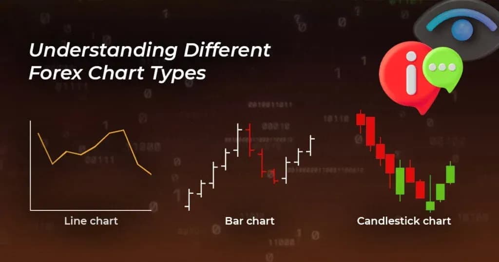
- The three main chart types are line charts, bar charts, and candlestick charts, with candlesticks being the most widely used.
- Line charts are simple but limited, showing only closing prices without detailed price action.
- Bar charts (HLOC) provide more detail, including open, high, low, and close prices.
- Candlestick charts offer the most information with color-coded visuals, patterns, and clear market sentiment.
- Beginners should start with higher timeframes (H1, H4, Daily) to reduce noise and understand trends better.
- Less common charts like mountain and point & figure are not ideal for beginners.
- The best chart for beginners is candlestick charts because they are easy to read, data-rich, and widely used in trading strategies.
Every trader needs to learn how to read forex charts. As a beginner trader learning the ins and outs of prop trading firms, you must start by learning about the different types of charts. These charts, no matter your strategy, will help you make the best trading decisions.
For example, experienced traders who use technical strategies such as price charts swear that graphs and patterns of market data showcase the factors that move forex markets. Examples of such factors include news events, supply and demand, and market sentiment

Login in To Access Our Trader Dashboard
Trade Now With Audacity CapitalBelow is a look at the different types of charts and what to know about each.
Trading With Forex: Common Types Of Charts
On your journey to becoming a funded pro trader, you’ll notice that forex charts comprise two data sets: price data and timeframes. Experienced traders rely on three main types of forex charts. These are line charts, bar charts, and candlestick charts.
See also: Struggling to face losses in forex trading? Here’s how to bounce back
Figure, point, and mountain charts are less common, but you can find them on Meta Trader 4 platforms. Each chart will have varied timeframes and pricing data. Often, the y-axis will represent the price points, while the x-axis will represent the timeframe.
When it comes to the timeframes, please note that this can be in seconds, minutes, or even days. Traders looking to make short-term trades prefer the one-minute and five-minute charts. Those going for long-term ones will opt for the fifteen-minute and one-hour charts.
1. Mountain Chart
Mountain charts are not very different from line charts. Their main differentiating factor is that the area under a mountain chart tends to have a deeper colour shade than the other areas.
Some beginner traders prefer mountain charts because they’re easier to understand than line graphs. But while this may be the case, these charts aren’t recommended for day trading. This is because mountain charts don’t showcase the price action for each time unit.
However, you’ll find them useful when trying to define long-term trends. These are the trends you need to confirm fundamental indicators or analyze other charts.
2. Line Charts
As far as charts are concerned, these are the simplest visual representation of market happenings. The time sits on the x-axis, with the prices sitting on the y-axis. The line charts show information for the price movements at each time interval. A simple line helps connect the different price points.
The pricing information generally comes from the price noted at the end of each timeframe. For instance, if using a 15-minute chart, the price information on your chart will represent the price recorded at the end of the 15-minute interval.
Learn More: Why We Dont Use Demo/simulator Trading During Our Training Programs?
One major downside to using the line chart is that it doesn’t indicate what has happened during that 15-minute interval. What this means is that the price may fall or rise significantly within this period, but your chart won’t capture these movements.
Consider using a line chart when trading indices.
Are You Looking For A Funded Trader Program?
Join the Funded Trader Program3. Bar Chart
The bar chart features vertical bars. Traders on a prop firm trading platform sometimes call it the HLOC chart. HLOC is a short form for high, low, open, and close. For each bar that you’ll encounter, it will represent a single unit of time. The uppermost part of the bar shows the high for that timeframe, while the bottom part shows the lows.
Your bar chart will also contain a horizontal notch: one on the right side and another on the left. The left shows the opening price, and the right one displays the closing price. You need this information when using price action trading strategies. It’s possible to use different combinations of bars to develop a pattern showing market movements.
Traders with years of experience on prop firms that allow EA at times use bar charts with overlays like moving averages and Bollinger bands. The goal here is to try to predict momentum.
4. Point And Figure Charts
Beginner traders commonly avoid point and figure charts when starting out. However, as you become accustomed to reading charts, you can use them together with other charts to learn useful insights.
A point and figure chart has the same setup (x-and y-axis) as a line chart. The difference with line charts is that traders use “X” and “O” marks to show rising and falling prices, respectively. A trader can place multiple “Xs” and “Os” to showcase different time units. In the chart, you’ll have a line moving from the lowest to the highest price per timeframe.
Also Read: how To Use Technical Indicators To Trade Forex?
This type of chart is useful to a trader looking to get insights on intra-day prices.
5. Candlestick Charts
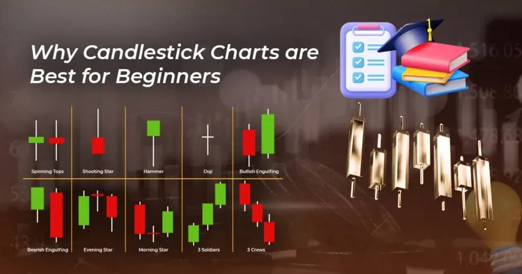
Lastly, we have candlestick charts that have become a favourite with many beginner traders. These charts provide high, low, open, and close data. The reason behind their popularity is that they have thicker bars and colours. This makes them easier to read and interpret.
Many beginner traders choose to start with candlestick charts when starting forex currency trading. The following is why:
- They have dozens of patterns: When using prop firms that allow EA, you’ll have an opportunity to back-test different patterns. These allow you to see which patterns are the most effective and which currency pairing will do well with your pre-selected indicators.
- They’re Color Coded: Light or white bodies indicate that the open is low while the close is higher. In trading terms, this means the market is on an upward trajectory. Solid, red, or dark bodies mean the opposite.
- Candles Have Thick Bodies: The upper and lower areas of the chart body represent the open and closed positions. On the other hand, the “shadows” or wicks will appear at the upper and lower areas of the chart body. This shows the highs and lows of that timeframe.
Conclusion
If you’re wondering which chart is the best for beginner traders, try the Candlestick charts. It has dozens of patterns, is colour-coded, and has thick bodies. These charts have everything you need to make an informed trading decision.
FAQ
The candlestick chart is the best for beginners because it clearly shows price movements, trends, and market sentiment in an easy-to-understand format.
Candlestick charts provide more information than line charts, including:
- Open and close prices
- High and low levels
- Market sentiment (bullish or bearish)
Line charts only show closing prices, making them less useful for trading decisions.
Bar charts are useful but can be confusing for beginners. Candlestick charts are preferred because they are more visual and easier to read quickly.
Beginners should start with:
- 1-hour (H1)
- 4-hour (H4)
- Daily (D1)
These timeframes reduce noise and help understand trends better.
Yes, beginners can use simple indicators like:
- Moving averages
- RSI
- MACD
But it’s best to avoid overloading charts with too many indicators.
Common mistakes include:
- Using too many indicators
- Switching between multiple chart types
- Trading on very low timeframes (like 1-minute charts)

Ready to apply disciplined risk to crypto? Explore Audacity Capital's new crypto instruments and bring your trading strategy.
Learn MoreNewsletter
Join our newsletter to stay up to date on features and releases.
Join Our Social & Community
Start Your Journey Today With Our Free Trial
Proudly showcase your skills and accomplishments through certificates and get recognition for your hard work and dedication from potential investors and peers.
Free TrialRelated Articles

Supply And Demand Zones: A Complete Guide For Serious Traders
Learn how to trade supply and demand zones with proven strategies, real examples, and smart risk management tips to improve consistency with Audacity Capital.

How to Trade Gold (XAUUSD): The Complete Guide
Learn how to trade Gold (XAUUSD) like a professional trader with Audacity Capital. Discover proven strategies, risk management techniques, session timing, and expert tips for consistent gold trading success.

The Santa Claus Rally. What Traders Need To Know As The Year Comes To A Close

10 Best Prop Trading Strategies for Consistent Profits (2026)
Discover the best prop trading strategies, including risk management, trade setups, and proven methods to achieve consistent profits as a funded trader.